My Action Bar
A fully customizable action bar datapack - display world info your way.
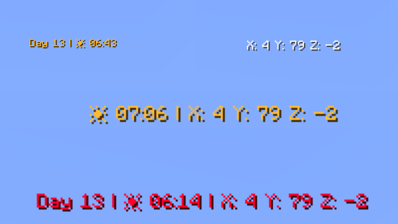
Datapack that lets you customize the information displayed in your action bar. Choose which elements are visible and which are hidden, so you only see the information that matters most while playing.
Features
Day Counter
Shows the current in-game day number. Toggle the Day prefix on or off to suit your style.
Weather Indicator
Displays the current weather in one of two modes:
Icon mode (default) — uses intuitive icons:
- ☀️ Clear sky
- 🌧️ Rain
- ⚡ Thunderstorm
- ❄️ Snow
- ❄️⚡ Blizzard (snow + thunder simultaneously)
Text mode — displays weather as plain text:
- Clear →
Sun - Rain →
Rain - Thunderstorm →
Thunder - Snow →
Snow - Blizzard →
Snow Thunder
Hidden automatically in the Nether and End, where weather doesn't apply.
Clock
Displays the current in-game time in two available formats:
- 24-hour (default) — e.g.
14:30 - 12-hour — e.g.
2:30 PM
Coordinates (hidden by default)
Shows your current X, Y, Z position. Toggle the coordinate prefix on or off independently.
Facing Direction (hidden by default)
Shows which direction you're currently looking. Supports full names (e.g. West), abbreviated names (e.g. W), and optional intercardinal directions (e.g. North-East / NE).
Player Head (hidden by default)
Displays your player head icon inside the action bar for a personalized touch.
Dynamic Gradient Color System
The action bar text color smoothly transitions based on the in-game time shown on the clock. The chart below shows the full 24-hour color cycle:

00:00 → 04:00 — Deep purple/indigo (late night)
04:00 → 08:00 — Warm golden yellow (sunrise)
08:00 → 12:00 — Fading into bright white (morning)
12:00 — Pure white (noon peak)
12:00 → 16:00 — Shifting into warm orange (afternoon)
16:00 → 20:00 — Deep orange-red (sunset)
20:00 → 23:59 — Fading back to cool blue/purple (night)
Fun fact: Every single hour and minute has its own individually defined color — that's 1,440 unique color values declared in total!
Full Per-Player Customization
Every player can personalize their own action bar using /trigger commands — no operator permissions needed.
Available Commands
| Command | Description | Default |
|---|---|---|
/trigger version | Display the current datapack version | - |
/trigger default | Reset all settings to default | - |
/trigger random | Randomize all action bar settings | - |
/trigger show | Toggle the action bar on/off | Shown |
/trigger show_days | Toggle the day counter | Shown |
/trigger show_weather_info | Toggle the weather indicator | Shown |
/trigger weather_info_type | Switch weather display mode | Icon mode |
/trigger show_clock | Toggle the clock | Shown |
/trigger time_format | Switch clock between 24h and 12h | 24-hour |
/trigger show_cordinates | Toggle coordinates | Hidden |
/trigger show_days_prefix | Toggle the "Day X" prefix text | Shown |
/trigger show_cordinates_prefix | Toggle the coordinate prefix labels | Shown |
/trigger show_facing_direction | Toggle the facing direction indicator | Hidden |
/trigger facing_direction_type | Switch between full and abbreviated direction names | Full |
/trigger facing_direction_advanced | Toggle intercardinal directions | Disabled |
/trigger show_player_head | Toggle the player head icon | Hidden |
/trigger dynamic_clock_color | Toggle the dynamic gradient color | Enabled |
/trigger set_color | Set a static solid color (requires dynamic OFF) | Default color |
/trigger text_style | Set the text formatting style | Default |
/trigger separators | Change the separator character between elements | • |
/trigger external_separators | Change or enable outer separators | Disabled |
/trigger display_order | Change the display order of elements | Default |
Weather Display Mode (/trigger weather_info_type)
set 0— icon mode (default)set 1— text mode
Clock Format (/trigger time_format)
set 0— 24-hour format (default)set 1— 12-hour format
Facing Direction Type (/trigger facing_direction_type)
set 0— full names, e.g.West(default)set 1— abbreviated names, e.g.W
Intercardinal Directions (/trigger facing_direction_advanced)
set 0— cardinal directions only (default)set 1— include intercardinal directions, e.g.North-East/NE
Text Style (/trigger text_style)
Choose from 13 formatting styles for the action bar text:
set 0— default formatting (default)set 1— underlineset 2— boldset 3— bold + underlineset 4— italicset 5— italic + boldset 6— italic + underlineset 7— italic + bold + underlineset 8— strikethroughset 9— strikethrough + boldset 10— strikethrough + underlineset 11— strikethrough + italicset 12— strikethrough + underline + italic + bold
Separator Picker (/trigger separators)
Change the character that separates elements in the action bar.
/trigger separators set 0— use the default•character/trigger separators set <1–64>— pick a specific separator/trigger separators add <value>— offset from your current separator
See the full separator palette on the website
Outer Separator Picker (/trigger external_separators)
Add decorative separators at the very beginning and end of the action bar.
/trigger external_separators set 0— disable outer separators (default)/trigger external_separators set <1–64>— pick a specific outer separator style/trigger external_separators add <value>— offset from your current selection
Display Order (/trigger display_order)
Rearrange the order in which elements appear in the action bar.
/trigger display_order set 0— restore default order (default)/trigger display_order set <1–719>— choose one of the available orderings/trigger display_order add <value>— offset from your current order
Static Color Picker (/trigger set_color)
When dynamic color is disabled, choose from 64 handpicked colors organized by palette:
White (1–6) → Red (7–11) → Orange (12–15) → Yellow (16–21) → Green (22–28) → Cyan (29–32) → Blue (33–42) → Purple (43–47) → Pink (48–52) → Brown (53–56) → Other (57–64)
/trigger set_color set <1–64>— pick a specific color/trigger set_color add <value>— offset from your current color/trigger set_color(alone) — cycle to the next color/trigger set_color set 0— revert to default color
See the full color palette on the website
Quick Command Reference
All commands follow the same toggle/set pattern:
set 1→ enable/showset 0→ disable/hide or reset to default- Bare trigger (e.g.
/trigger show) → toggles between states
Credits
Creator: MrKazanek
Thank you to everyone who supported this project! ❤️